20 shopping cart design must haves
Shopping cart design is often a subject of compromise for software and SaaS companies. Nevertheless, checkout is the most critical step in the conversion process and its design can serve as an active guide for the shopper on his way to your desired outcome - the purchase.
A shopping cart can play a series complex functions and this is why every single detail in it matters. Besides accepting a payment, a shopping cart should play an important part in making the customers feel that they are making the right choice and that they are absolutely safe by entrusting their personal data to it. Moreover it can greatly improve the shopping experience and ultimately, encourage repurchase.
Let’s take a look at 20 must haves in your shopping cart design that successfully achieve these goals:
1. Detailed Product Information
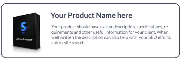
Besides your website, the product description should be an integral part of the shopping cart design and it should answer all the commonly asked questions by the potential customers. If your product information is well written and corresponds to your research for relevant keywords, that will additionally serve your SEO efforts and in-site search.
2. Large and clear product photos

Product branding plays an important part in your customers’ purchasing decisions. Make sure the shopping cart design, including your branding, company and product photos are consistent with the rest of your website not to compromise on shoppers’ confidence.
Offer your potential customers an additional user experience boost by showcasing the product directly in the shopping cart. Include detailed high-quality images of the product for your customers to easily see your product in the luxury of detail, such as:
- Product design
- Product features
- Add-ons
3. Offer additional products
.webp?width=406&height=366&name=one-time-offer-1%20(1).webp)
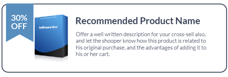
If a visitor reached your shopping cart, it is an easy opportunity to offer additional products that go well with his selection. Showcase additional products and have time-limited offers as well, in order to create a shopping momentum and sense of urgency for the customer.
When cross-selling, it is important not only to tell them how much this product costs, tell them how much they are saving too! This way you will encourage impulse buying and you will increase your average cart value. Win-win, right?
No 3rd party integrations. No hidden costs. No wasted time.
Just a solution as unique as your business’s needs.
4. Alternative Payment Methods
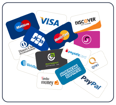
When you sell internationally, it means you need to adapt to specific market preferences. Yes, there are still a lot of countries where credit and debit cards are not very popular. PayPal also hasn’t arrived to many countries just yet.
On another hand, a large share of folks who own credit cards, are not comfortable using them online, preferring to use alternative payment methods such as eWallets instead.
If we add-up the ones who don’t owe a credit card and those who just don’t want to use them online, we get a very large number of unserved users in case your selection of payment methods is reduced to just a couple of them. Don’t let this happen and adopt popular local payment methods such as Alipay in China or Boleto Bancario in Brazil.
5. Clear security information
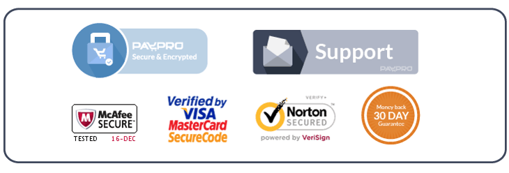
Security is one of the top concerns for software shoppers. Many shopping carts are abandoned because of identity theft and fraud anxieties among customers. Give them a peace of mind by displaying security information as the SSL, Verified by Visa and MasterCard SecureCode logos.
6. Clear customer service information
Customers often need hand holding while making a purchase. Even a tiny issue or complication can automatically turn your shopper away from the shopping cart. It's important to understand that a huge part of your sales is the service that you provide along with your product and this includes shopping assistance. The customer service contact information should be clearly visible on every page - especially the phone, but also the email. Don’t forget about the FAQ, that should include all the commonly asked questions.
7. No registration required
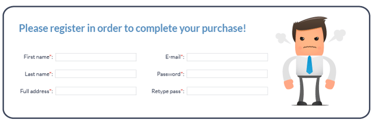
Although it is something that is removed, the lack of registration can be considered as a benefit in the shopping cart.
Many software and SaaS products require users to create an account. But since you are asking a customer their personal information during the registration and during payment, why ask them twice? Unify the checkout and account creation, add form fields if necessary and you will avoid annoying your customer and causing him to drop out from the conversion process.
8. Express checkout for returning customers
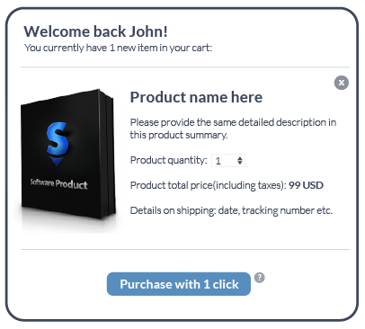
One of the biggest eCommerce mistakes is the idea that businesses are always hunting for new customers. This causes them to forget about their current customers.
The most successful software and SaaS companies take advantage of their growing user base by developing the relationships with them through social media and email marketing, rewarding them with special offers and new product news.
Did you know, that an average conversion rate for an existing customer is whopping 60%? Well why not treat them well by offering one-click purchase, since they already bought from you? Don’t make them fill in all those forms again.
9. Analytics and Sales Reporting

You probably use Google Analytics to track your shopping cart conversions. Of course, your shopping cart solution has reporting in place, but why not have it all under one roof? Make sure your eCommerce solution easily integrates with your Google Analytics account, so it accurately tracks all the steps in your shopping cart, including the Thank You Page. This way your data will always be precise and you will know which steps need fine-tuning to build that smooth conversion path for your customers.
10. Coupons and discounts

Promotions and discounts through various campaigns is an integral part of selling software and SaaS online. Your shopping cart provider should have an elegant solution for that, there is no other way around that. When you create marketing campaigns for various channels and segments, it is a lot easier to create a discount code database and distribute them all over you channels. This way you can drive loyalty and measure your campaign effectiveness with minimum effort.
11. Localization

When selling globally, you need to think locally too. Your shopping cart should be empowered by GeoIP technologies and display the information in the user’s language and currency. This way you avoid misunderstandings and communication obstacles that eventually prevent abandonment. You really can’t expect every of your customers to speak English.
12. Smart Price Rounding
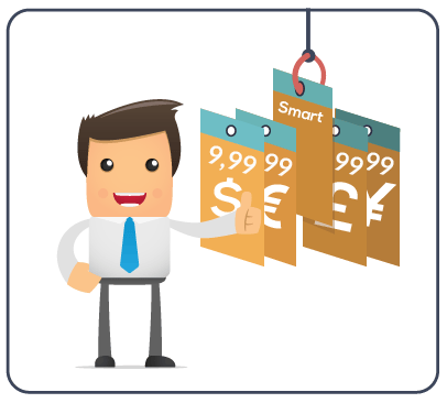
As a continuation of thought about localization, when displaying prices and hundreds of currencies, sometimes the currency conversions don’t look very pretty. As a rule of thumb in pricing display, the price is always read from left to right. So if your price is $9.99, you can’t expect to reach the same effect by a simple conversion and managing these manually can be a hell of a chore.
Smart Price Rounding can considerably ease this task by defining a reference currency (American Dollars, for example) and then you can set the system to round the price up or down to XX.99 for all other currencies. Neat.
13. Shopping Cart Editing Tools
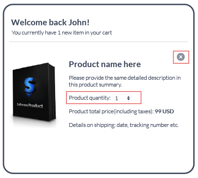
Customers often make mistakes and it’s okay. Sometimes the mouse clicked twice and the customer accidentally selected the same product twice, or they might change their minds up to the point they decided to pay.
Make it easy for your customers to update the items in the shopping cart, make sure they are intuitive and not confusing.
14. Responsive Design
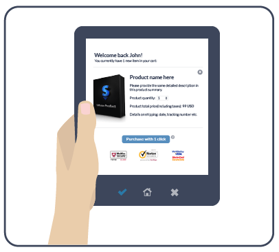
We are currently witnessing an explosive growth in sales from mobile devices, this means you should embrace mobile shoppers everywhere. If your shopping cart design doesn’t adapt to smaller screens and touch interface, this can only mean missed opportunities and lost sales.
15. Faster loading times

Do you like waiting? Neither do your customers. According to KissMetrics, 40% of shoppers abandon a page that takes more than 3 seconds to load.
Of course it’s a difficult task, considering all the text, images, links and dozens of other parts that make up a shopping cart, it can seem like a battle easy to lose. Unless you work with an eCommerce provider that makes load times a priority.
16. Remarketing tools
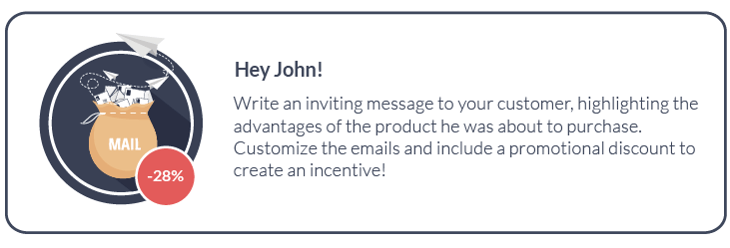
Every business that sells online is confronted with shopping cart abandonment. Also it is surprising to see how many eCommerce marketers still don’t do any kind of abandoned cart remarketing. As disappointing as an abandoned shopping cart can be, it still doesn’t mean it’s lost forever. Actually, 75% of customers who abandon, have a strong intention to buy and with a quite simple strategy it’s possible to regain 72% of those sales in the first 24 hours.
Make sure the eCommerce platform you use offers such tools as email capture (during checkout) and automated email remarketing sequence, where you can customize the emails and include a promotional discount to create an incentive. Your reports will thank you.
17. Free Trials

Customers who complete the journey to your shopping cart are ready buyers. Shopping cart is a very good place to offer free trials of your additional products. This way you specifically target these products to the right audience and maximize your additional product exposure, which might result in an additional sale.
18. Upselling
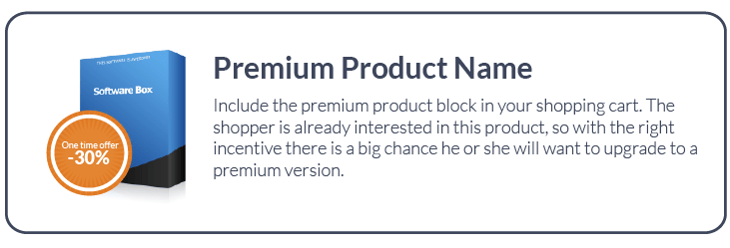
Make sure your shopping cart solution gives you the possibility to upsell your products to a premium version right in the shopping cart. Include a persuasive copy and a discount to make your customer feel that it’s a unique opportunity to buy a better product version for a reduced price.
19. Display steps required to complete the checkout
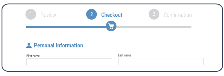
Let’s be frank here, nobody likes to fill in endless forms. But sometimes a long checkout is unavoidable when you join account registration and payment. To avoid annoyances, clearly display the steps the customer needs to take for this ordeal to finish and preferrably the time needed for the overall process. This way you will more efficiently manage their expectations and avoid abandonment as a result.
No 3rd party integrations. No hidden costs. No wasted time.
Just a solution as unique as your business’s needs.
20. Make errors obvious
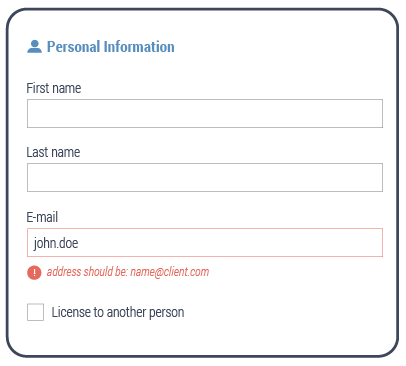
People make mistakes. When filling in a boring form, we sometimes make mistakes or miss a field. It is important to make the guidance clear for the user by highlighting the necessary fields and making the errors pop-out. Otherwise they will be repeatedly hitting the submit button without having a clue of what’s wrong. You don’t want that to happen, do you?
Conclusion
Obviously, all of these factors can fall in the category of user experience. User experience becomes one of the most important factors in eCommerce industry and this is how your business will set itself apart in the coming years.
Your shopping cart design should offer your customers a good time, easy navigation, clear guidance, simplicity and intuitivity and you will find customers for life.
Ioana Grigorescu
Ioana Grigorescu is PayPro Global's Content Manager, focused on creating strategic writing pieces for SaaS, B2B, and technology companies. With a background that combines Languages and Translation Studies with Political Sciences, she's skilled in analyzing, creating, and communicating impactful content. She excels at developing content strategies, producing diverse marketing materials, and ensuring content effectiveness. Beyond her work, she enjoys exploring design with Figma.
-
1.Explore PayPro Global's Solutions: See how our platform can help you streamline your payment processing and boost revenue.
-
2.Get a Free Consultation: Discuss your specific needs with our experts and discover how we can tailor a solution for you.
-
3.Download our Free Resources: Access valuable guides, checklists, and templates to optimize your online sales.
-
4.Become a Partner: Expand your business by offering PayPro Global's solutions to your clients.
Get the latest news


